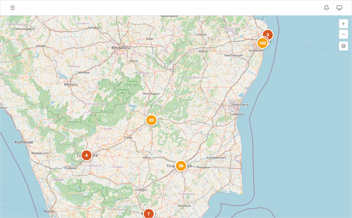
Geographic heatmaps overlay a color-coded density layer on top of the standard map view, so you can spot concentration patterns and coverage gaps across your entire portfolio without inspecting individual pins.
What heatmaps show
Instead of individual markers, the heatmap renders a continuous color gradient across the map surface. Areas with more leads appear in warmer colors (orange to red), while areas with fewer leads appear in cooler colors (blue to green).
This gives you an instant visual read on where your acquisition effort is concentrated — and where it isn’t.
Enabling heatmaps
- Open Map View from the sidebar.
- Click the Layers control in the top-right corner of the map.
- Toggle Heatmap on.
Individual lead and competitor pins remain visible underneath the heatmap layer. You can toggle pins off via the same Layers panel if you want a cleaner density view.
Reading the heatmap
- Red/orange zones indicate high lead concentration. If you see a dense red cluster, you have many active leads in that area — worth checking whether the market is getting crowded.
- Blue/green zones indicate sparse activity. These might represent untapped markets or areas your team has deprioritized.
- No color means no lead data in that region.
Zoom in to see finer-grained patterns at the neighborhood level. Zoom out for a district- or state-level portfolio overview.
When to use heatmaps
- Portfolio reviews — show leadership where the team’s effort is concentrated and where expansion opportunities exist.
- Territory planning — assign field executives to areas with high lead density so effort matches opportunity.
- Market gap analysis — identify regions with no coverage where competitors may be acquiring unchallenged.
- Board presentations — a single heatmap screenshot communicates portfolio spread more effectively than a table of coordinates.
Plan availability
Geographic heatmaps are available on Pro and Enterprise plans. Solo and Team users see standard pin markers on the map view. See Plans and Pricing for details.