The dashboard is your home screen in Proquiro, giving you a real-time snapshot of your lead pipeline, team activity, and key performance indicators. Everything you need to make decisions is right here.
Key sections
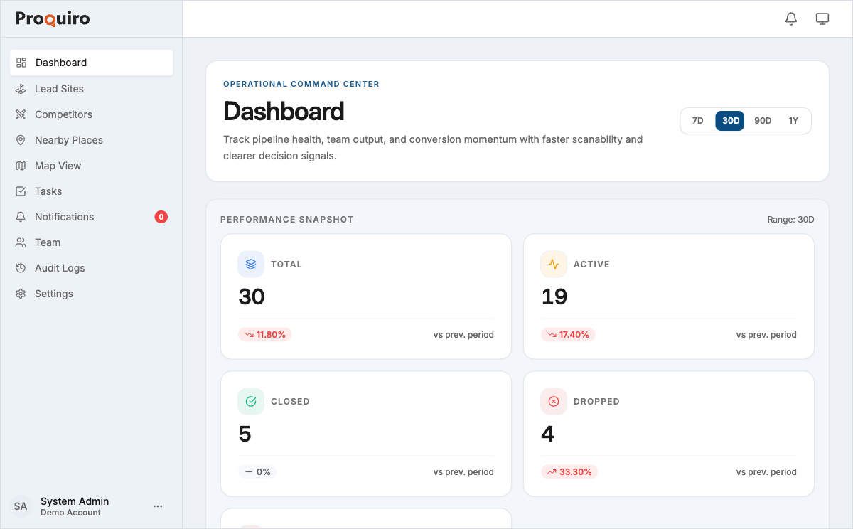
Performance Snapshot
At the top of the dashboard, five metric cards summarise your pipeline at a glance:
- Total — every lead site in the system, regardless of status
- Active — leads your team is currently working on
- Closed — successfully closed leads (the number you want to grow)
- Dropped — leads your team has consciously moved on from
- Rejected — leads that didn’t meet your criteria
Each card shows the current count and a percentage change compared to the previous period, so you can spot trends without digging into reports.
Pipeline Momentum
Below the snapshot, three cards track how fast your pipeline is moving:
- Leads Received — a chart showing new leads over time, useful for spotting intake patterns
- Conversion Rate — the percentage of leads that convert to Closed
- Range Momentum — pricing trend across your active pipeline, so you can see where the market is heading
Tip: Check Pipeline Momentum at the start of each week. A dip in Leads Received or Conversion Rate is easier to course-correct when you catch it early.
Intelligence Layer
The Advanced Metrics section surfaces deeper signals that aren’t obvious from headline numbers:
- Avg Close Time — average days from lead creation to close
- Stalled Leads — leads with no activity beyond a threshold (these deserve your attention first)
- Dropoff Rate — percentage of leads that drop out of the pipeline
- Resolution Rate — how quickly issues or tasks are resolved
- Close Share and Active Share — proportional breakdowns of your pipeline
Top Districts
A ranked view of the districts where your leads are concentrated. This is especially useful for spotting geographic clusters and planning field visits efficiently.
Team Performance
A table showing each team member’s performance with columns for Source, Leads, Closed, Stalled, and Conversion. See Team Performance Dashboard for details.
Tasks
A summary of upcoming and overdue tasks across the team. Overdue items surface first so nothing slips through the cracks.
Recent Activity
A feed showing the latest actions across your organisation — status changes, document uploads, task completions, and more. Think of it as the pulse of your team’s work.
Navigation sidebar
The left sidebar gives you access to all major sections:
- Dashboard — the home screen described here
- Lead Sites — view and manage your land acquisition pipeline
- Competitors — monitor competitor projects and pricing
- Nearby Places — schools, hospitals, and other points of interest near your sites
- Map View — see leads and competitors plotted on an interactive map
- Tasks — track and assign team tasks
- Notifications — in-app alerts for assignments, status changes, and more
- Team — manage team members and roles
- Audit Logs — a chronological record of all actions (Admin and Owner only)
- Settings — account profile, billing, and preferences
Quick actions
Tap the floating action button (the round button at the bottom-right of the screen) to quickly create a new:
- Lead Site
- Competitor
- Nearby Place
- Task
- Team Member
Tip: The floating action button is available from any screen, not just the dashboard. It’s the fastest way to capture a new lead while you’re in the middle of something else.